

Always working to get better at my craft. Open to joining a strong team or taking on new projects.
drury@caubycreative.com

This conceptual rebrand explores how Anchor Brewing Company and its flagship beer could evolve for modern shelves without losing what made it iconic.
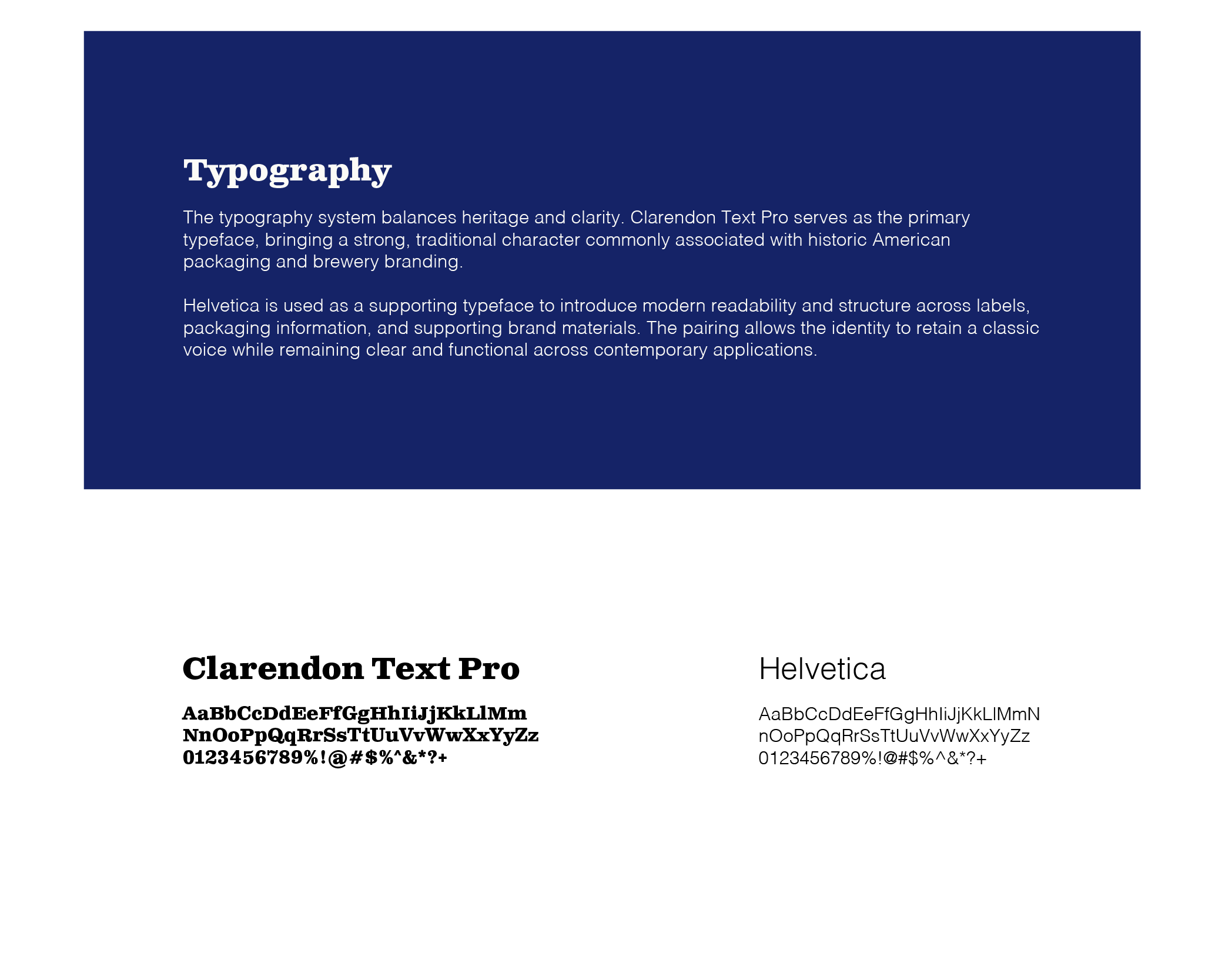
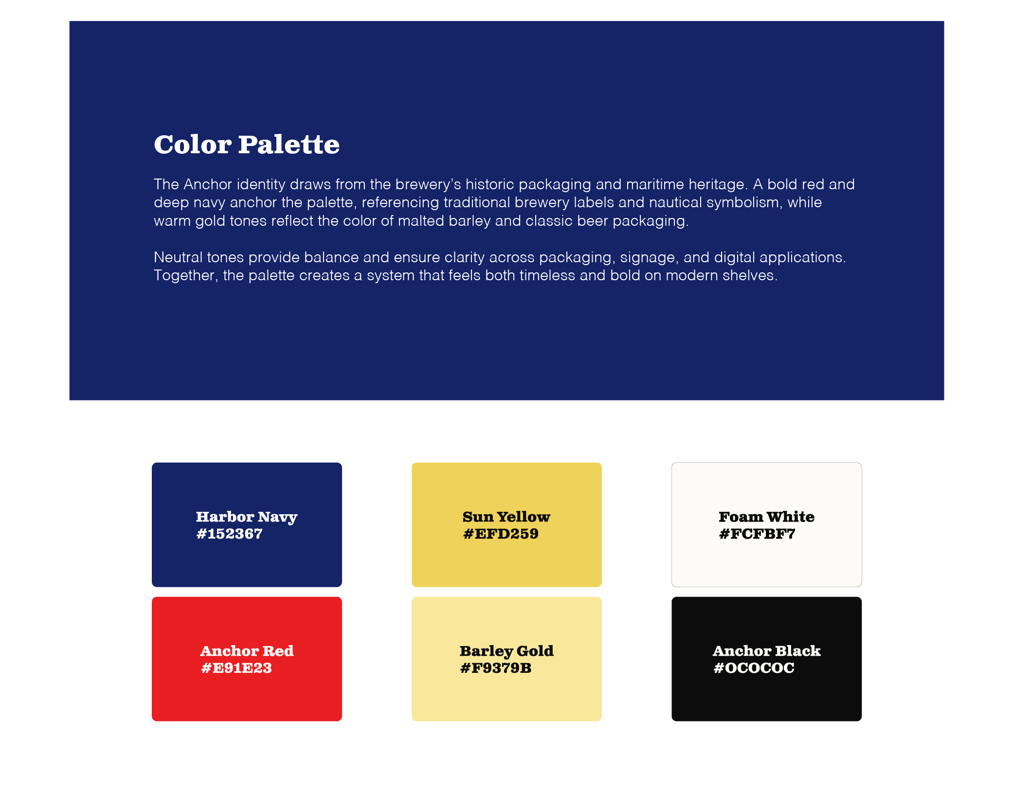
The focus is on restoring the character, storytelling, and ingredient-driven symbolism that defined the brand while introducing a cleaner, more scalable system.

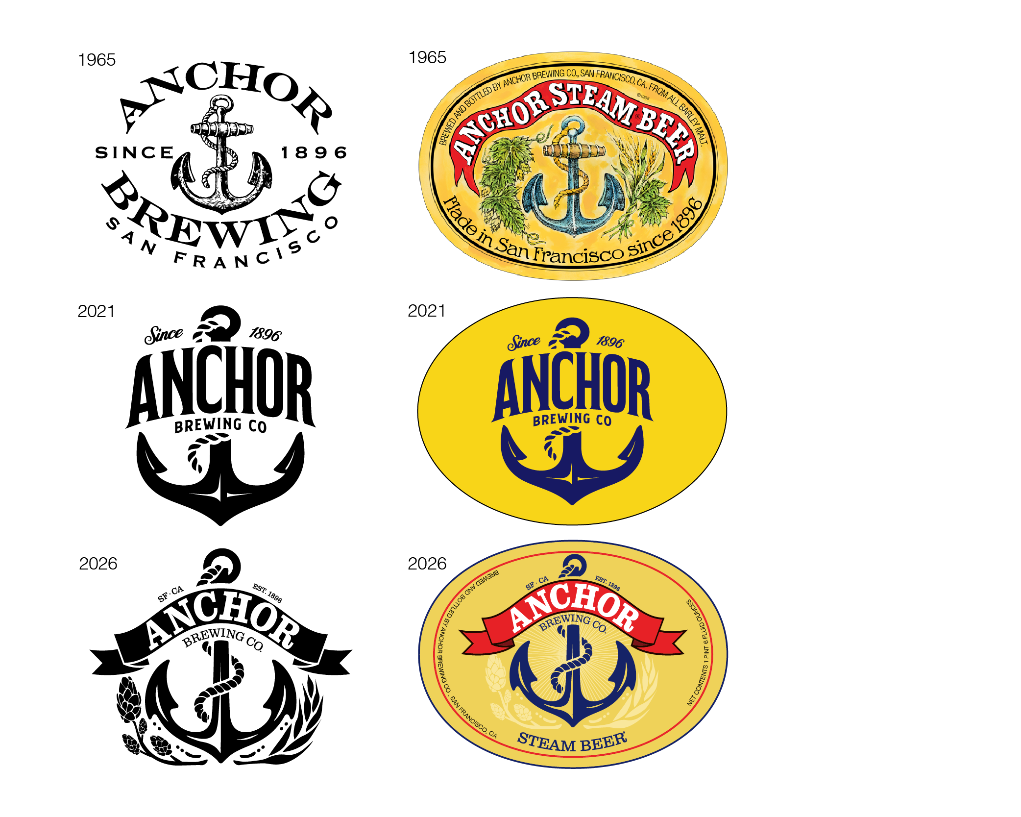
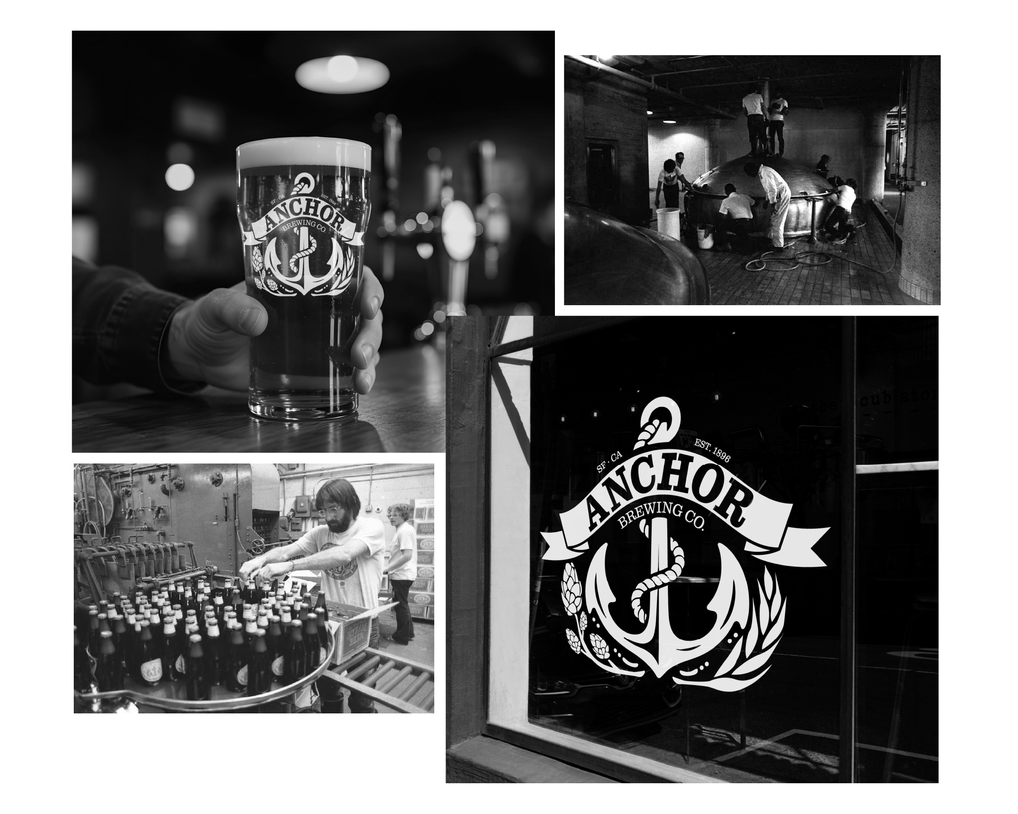
Anchor Brewing helped shape American craft beer, with a visual identity rooted in San Francisco and traditional brewing culture. Over time, efforts to modernize the brand simplified its packaging, and much of its personality and storytelling was lost.
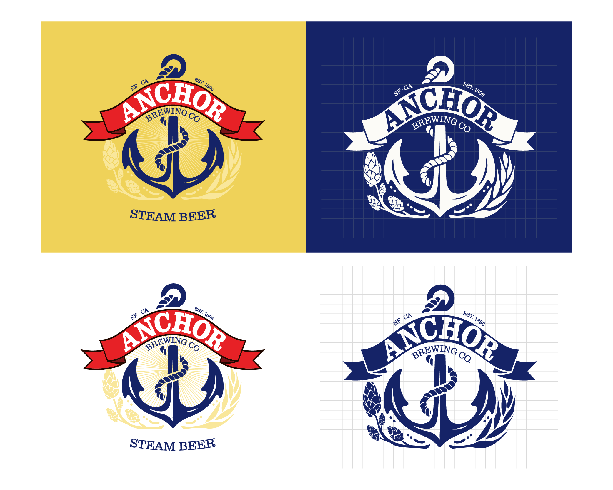
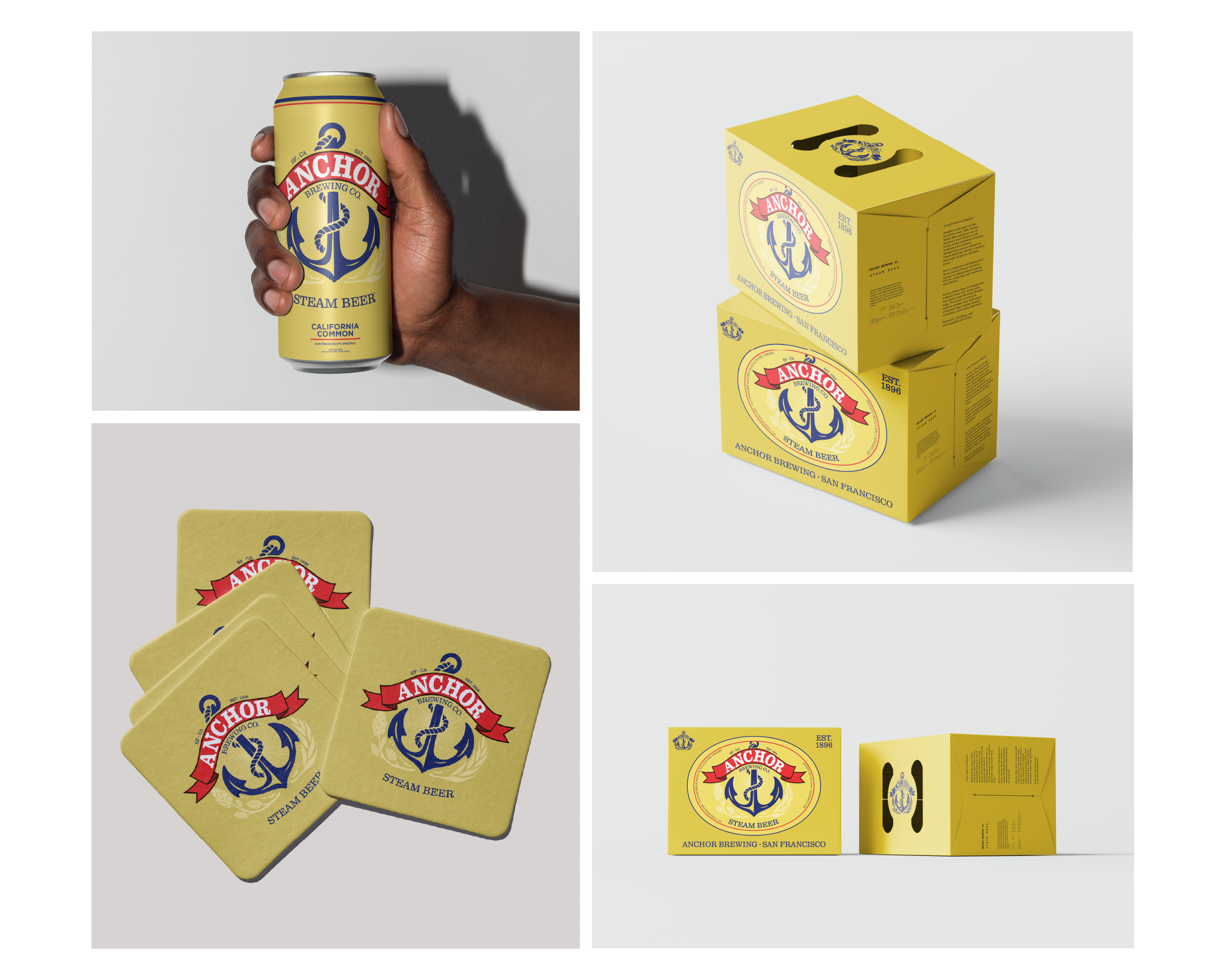
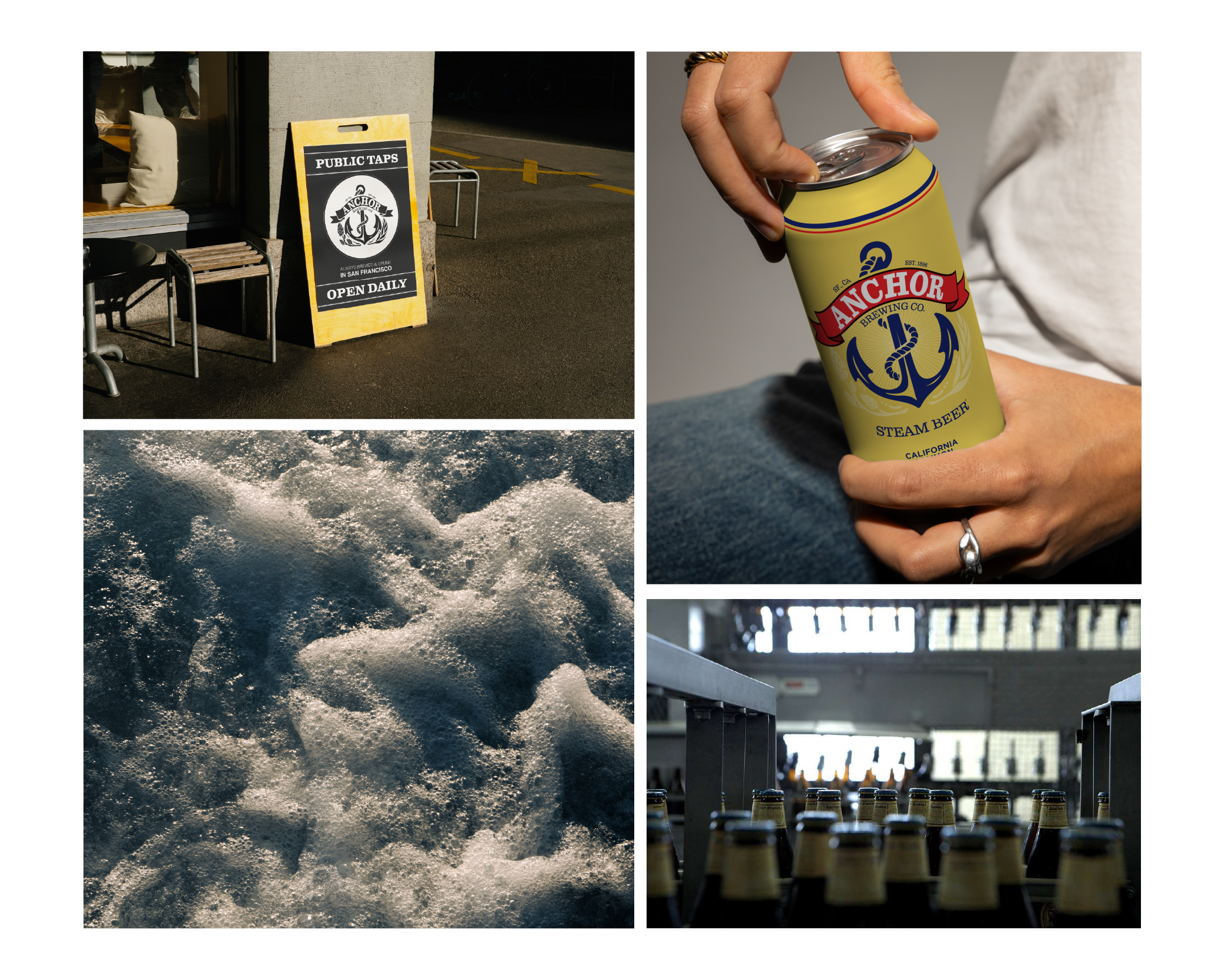
This project focuses on rebuilding that core identity. At the center is a unified brewery mark built from the anchor symbol, brewing ingredients, and founding year, designed to work across the full product line.
The application shown here focuses on Anchor Steam Beer as a proof of concept. It demonstrates how the system can carry over into packaging through typography, color, and subtle ingredient-driven details.
The result is a clearer, more cohesive identity that improves shelf presence while holding onto the craftsmanship and character that made Anchor distinct and recognizable.