

Always working to get better at my craft. Open to joining a strong team or taking on new projects.
drury@caubycreative.com

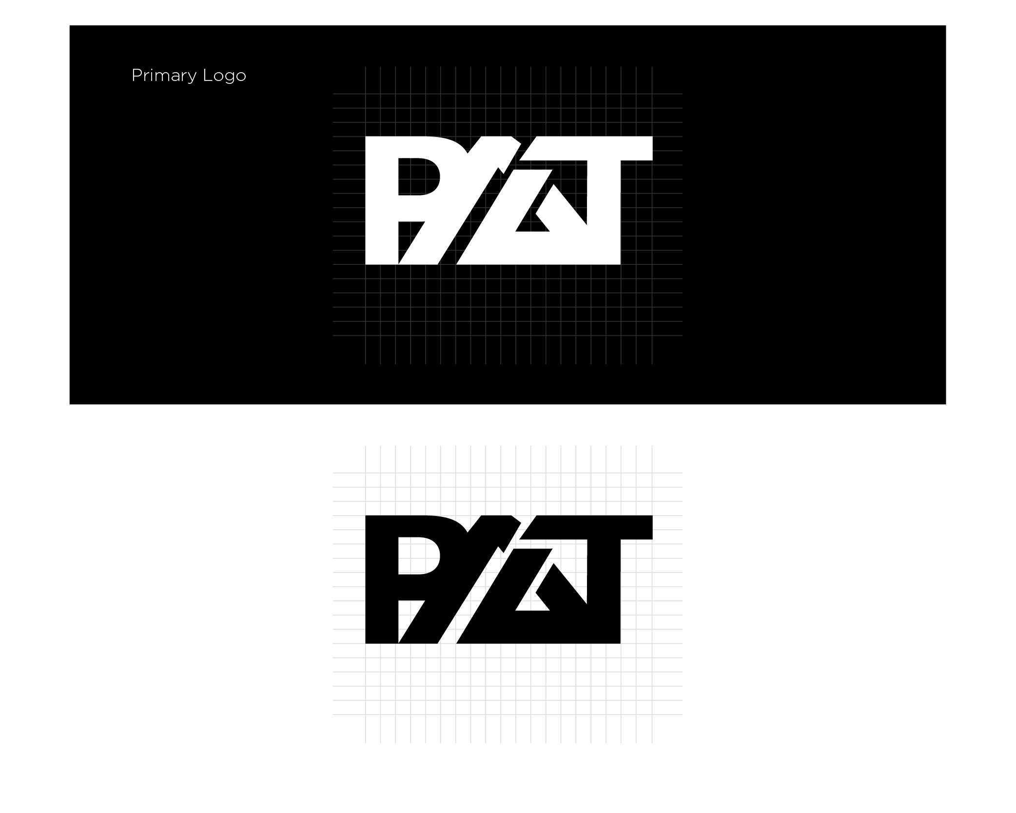
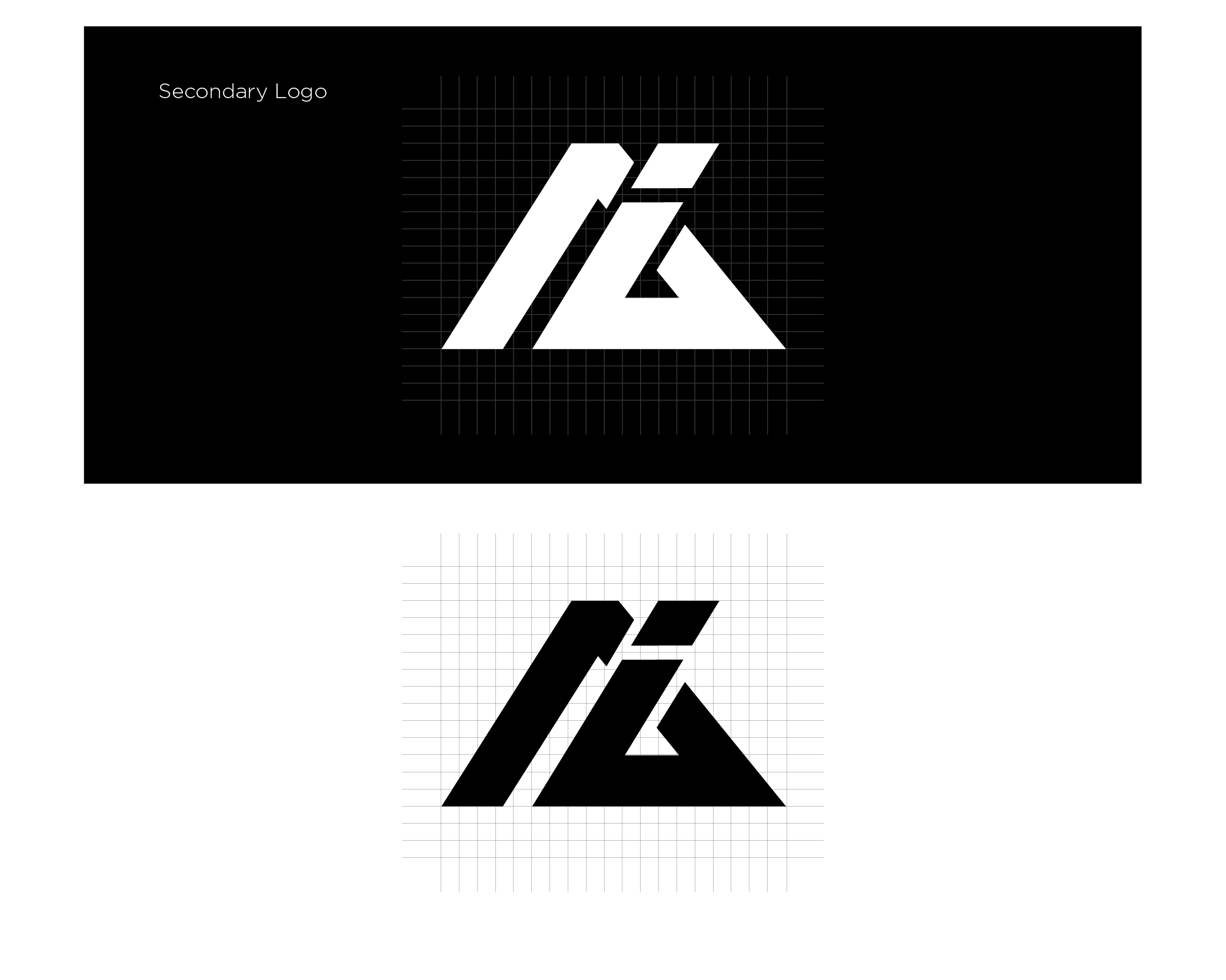
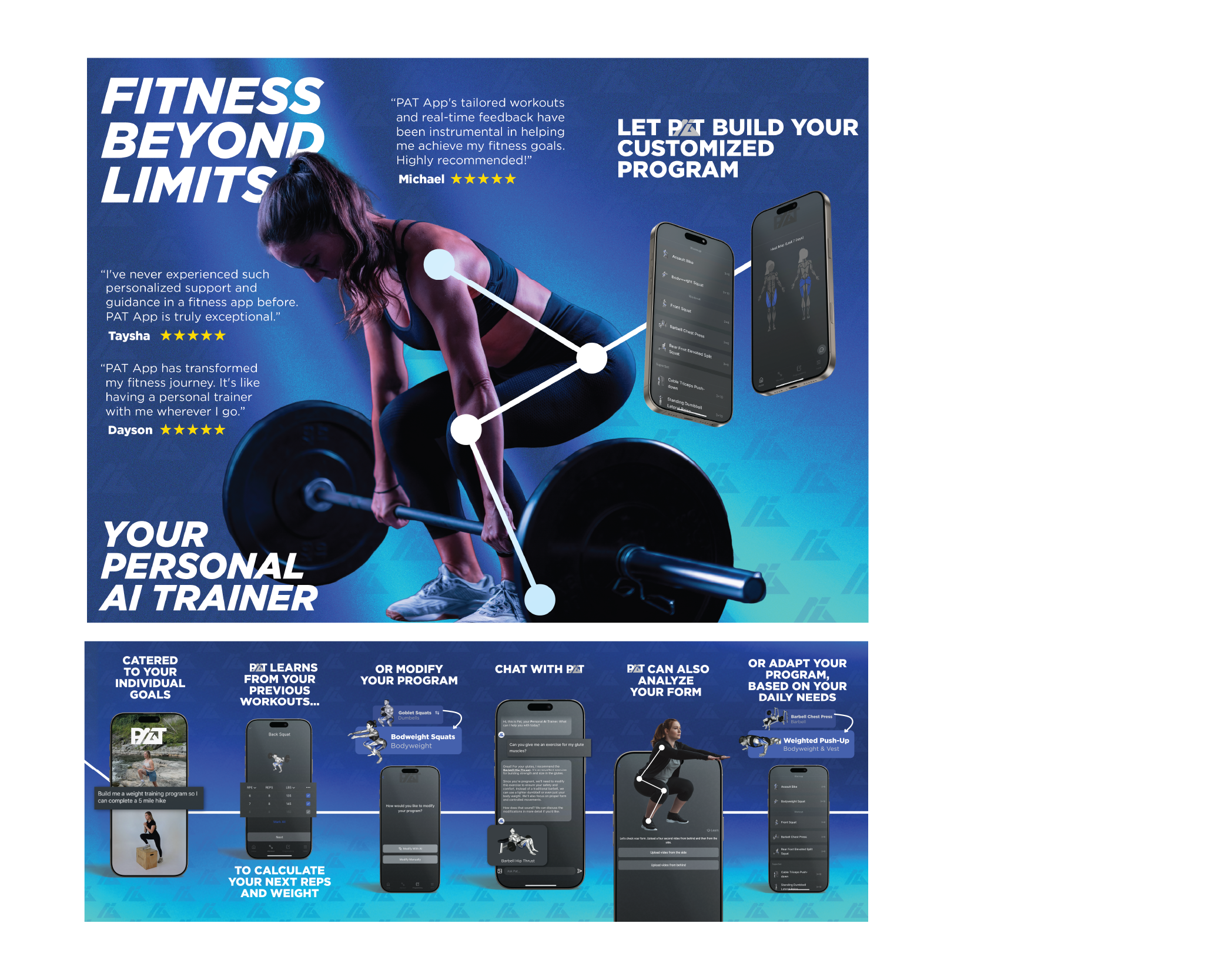
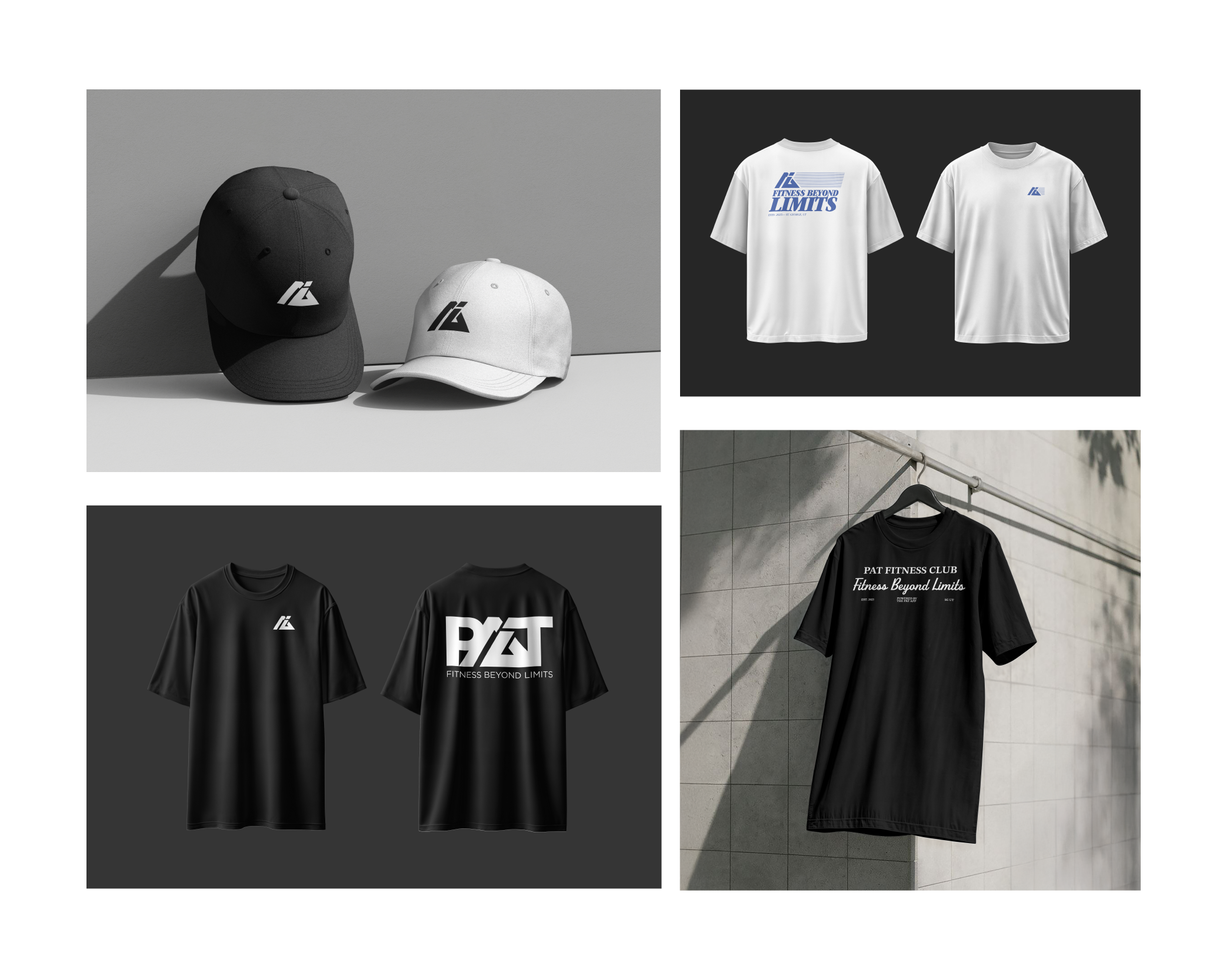
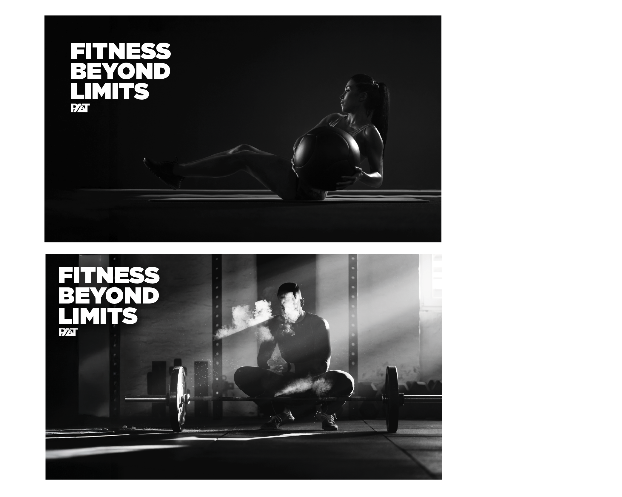
PAT is an AI-powered physical therapy app designed to make guided recovery accessible outside the clinic. I led the brand identity and App Store creative, creating a modern, trustworthy visual system that bridges healthcare credibility with fitness-tech energy.
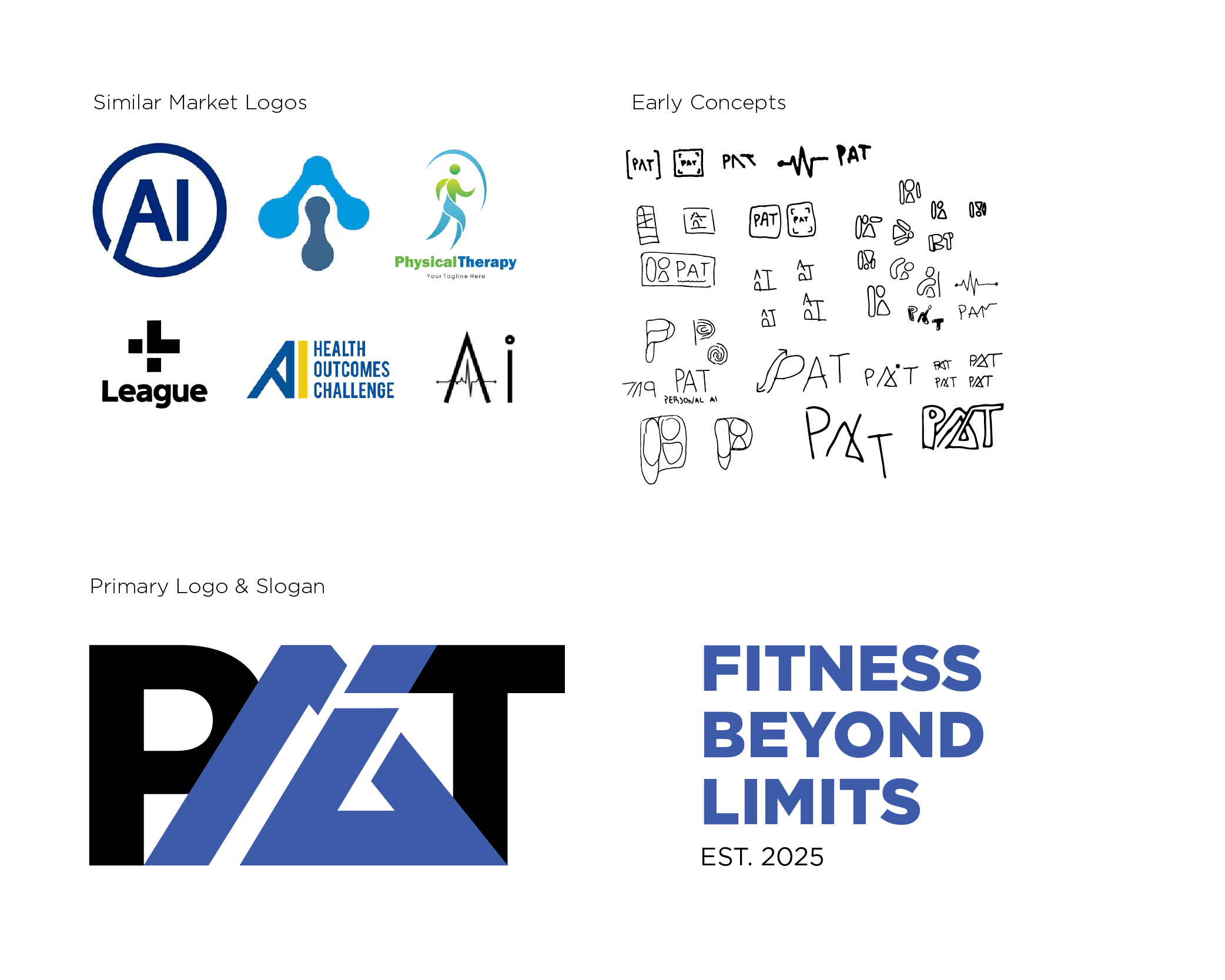
PAT entered a crowded health and fitness app market where trust, clarity, and usability are critical. The challenge was to create a brand identity that felt medically credible without becoming cold or clinical, while still feeling motivating and modern for everyday users. I developed a flexible brand system centered around a bold lettermark, clean typography, and a restrained visual language designed to scale across app icons, digital touchpoints, and App Store marketing. The result is a brand that feels confident, approachable, and built for a product people rely on during vulnerable moments in their recovery journey.